Elevated basics for daily life.
Common Place is your one stop shop for quality pieces that will last you years to come.
THE CHALLENGE
To create a mobile shopping app that is easy to navigate, with a simple colour palette and minimalistic design, reflecting on the brand itself.
ROLE
UX Designer
UI Designer
PLATFORM
Mobile
TOOLKIT
Illustrator
Photoshop
Figma
Invision
DATE
5 Weeks
Design Process
Tree testing > Flow Chart > Wireframes > Prototyping
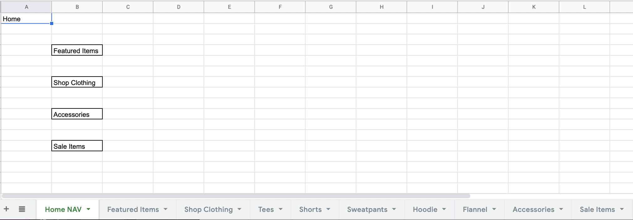
Tree Testing
Before anything else, I gathered up all of the items that were needed for the shopping app, and used the tree testing method to organize the product. I started out on paper, and moved to a spreadsheet to organize each category with individual tabs. From there, I was able to identify which items belonged in which category, and did simple user testing using specific questions to understand the user journey through the app.
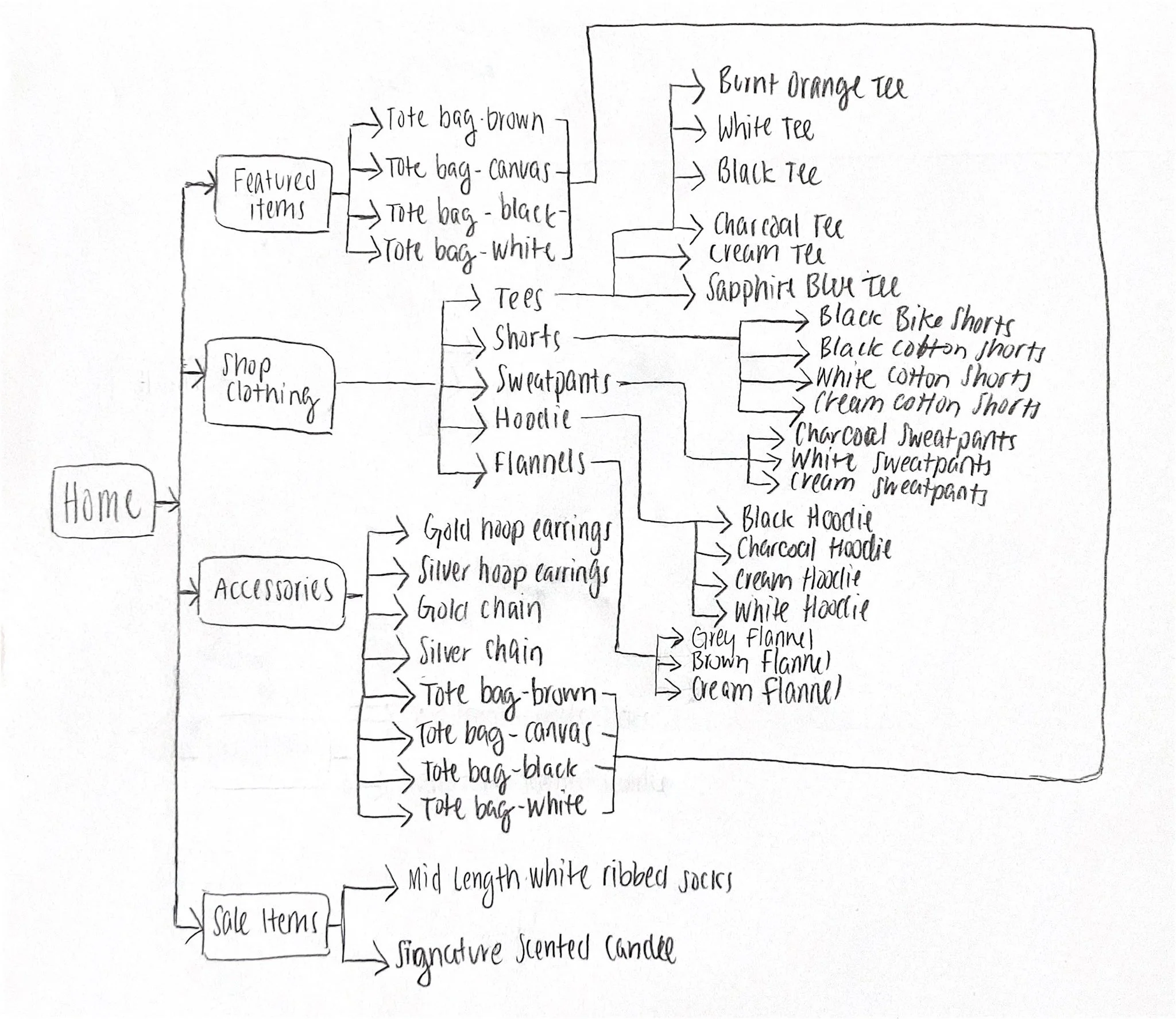
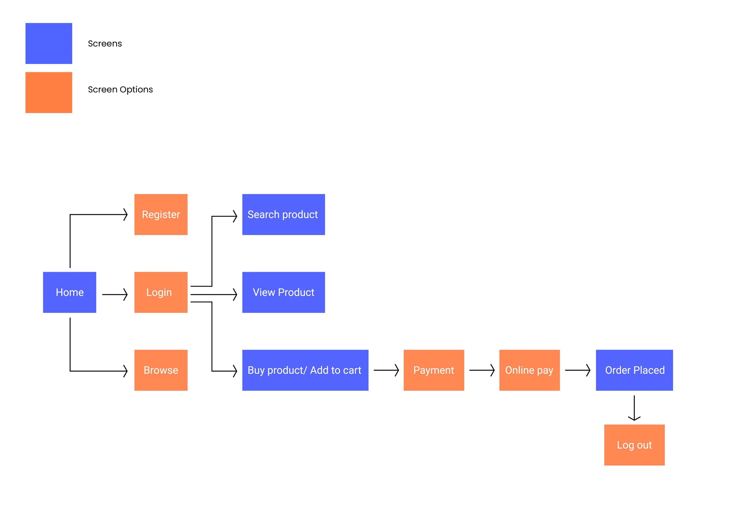
Flow Chart
I then started mapping out the screens and behaviours (options) of the user’s journey through my mobile shopping app.
Art Direction
COMMON PLACE is a clothing brand that lives and breathes simplicity for everyday basics. I strived to keep the imagery minimalistic and focusing on the product, and neutral colours, such as grey, to allow the bold colours of the clothing options to stand out. I chose a bold, royal blue for the most important buttons to grab the users attention.
Imagery
Colour Palette
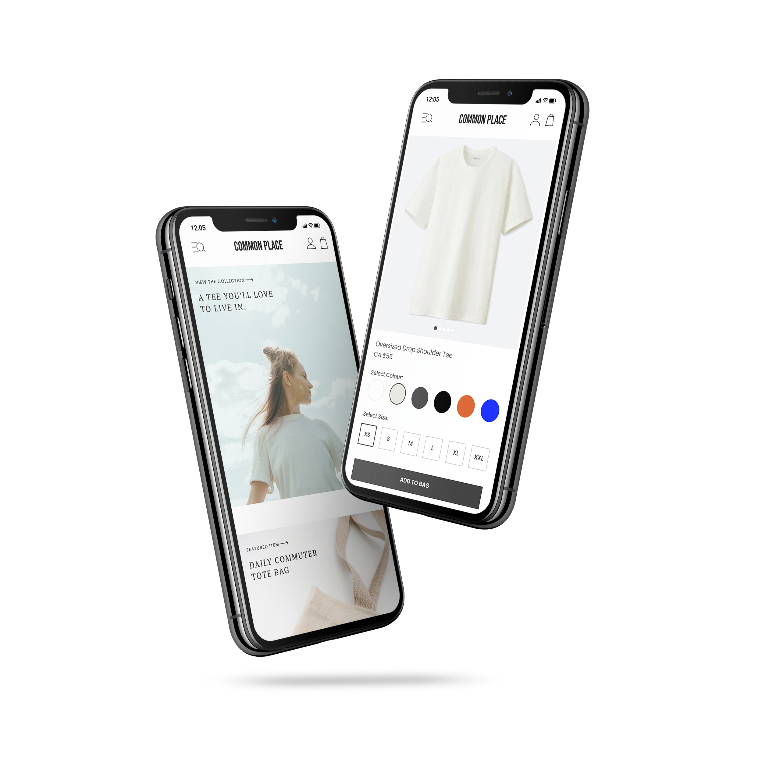
Mobile Wireframes
I decided to focus on the core screens of the shopping app, implementing the information I had gathered through the tree testing, flow chart and the art direction I had chosen.

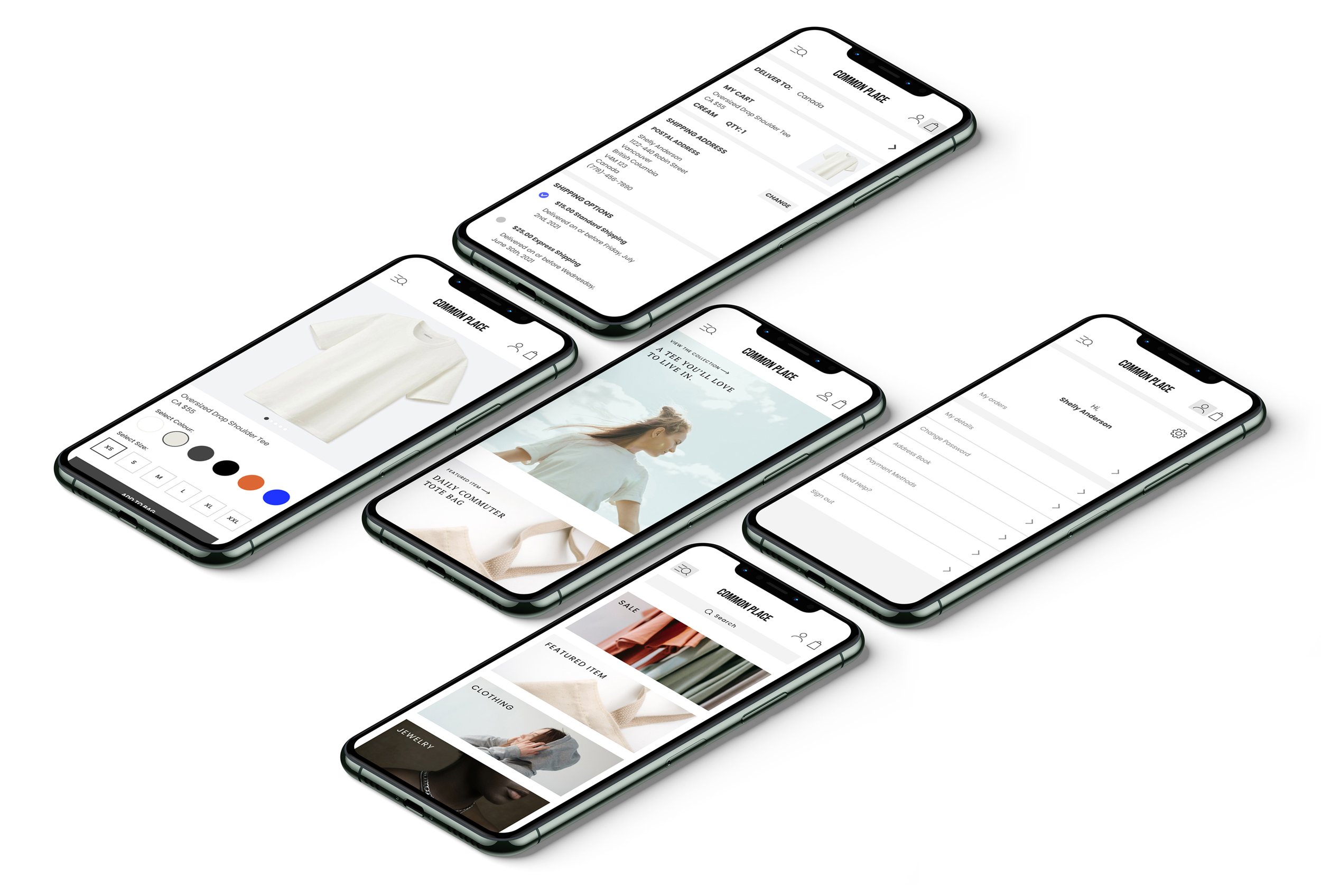
Final Prototype
I brought everything together to create the final prototypes for my mobile shopping app, COMMON PLACE.