
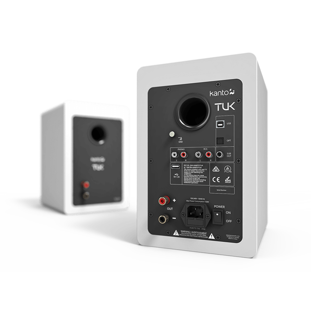
Premium Powered Speakers.
These speakers pack a punch when it comes to sound quality, and needed a logo that spoke volumes.
THE CHALLENGE
Kanto Audio was in need of a logo for their new line of premium speaker products coming out, called 'TUK'. Going with a bold, solid type face, I wanted to encompass the industrial look and feel of the physical casing of the speaker.
ROLE
Graphic Designer
PLATFORM
Print and Web
CLIENT
Kanto Audio
TOOLKIT
Illustrator
DATE
1 week
Design Process
Exploration > Initial Concepts > Final Concept
Exploration
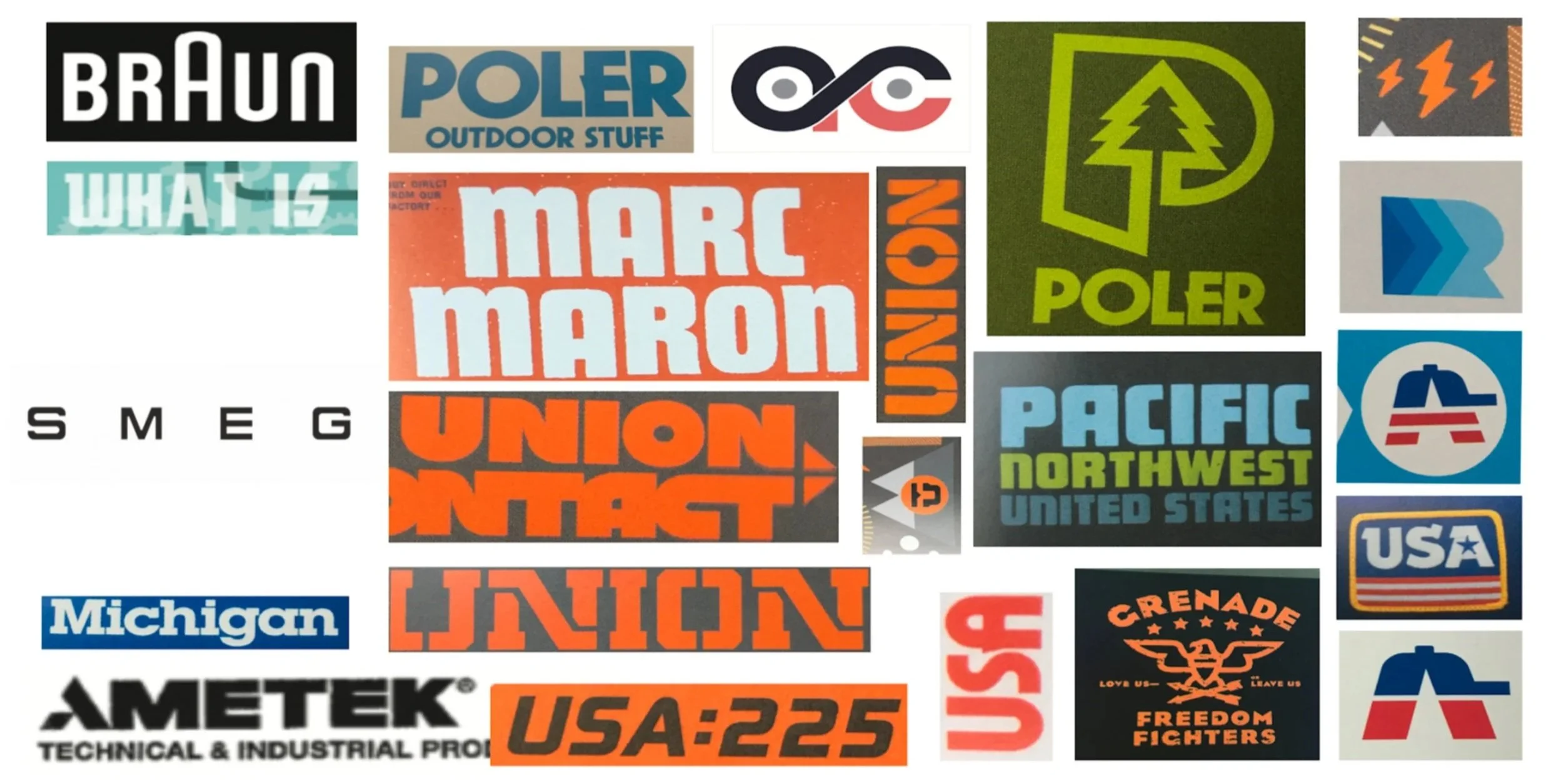
I began looking for inspiration and stumbled across Aaron Draplin's book Pretty Much Everything. It provided me an immense jump start into the look and feel I was going for. Below are some logos I took as inspiration, along with some other brands that sparked my imagination.
Initial Concepts
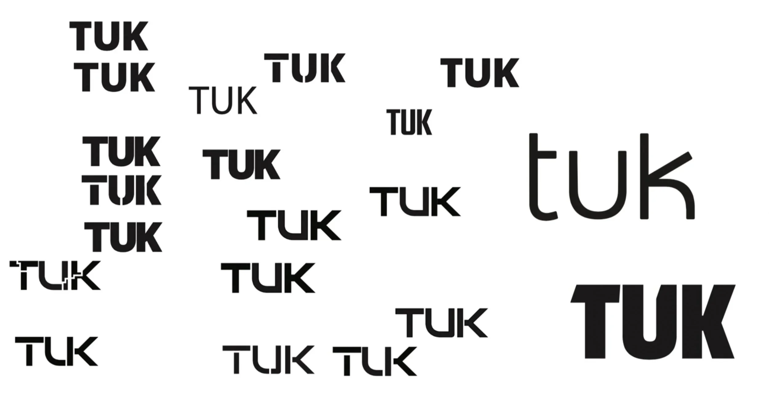
After sketching out some thumbnails, I jumped into illustrator and began playing around with fonts that I thought suited the industrial, yet minimalistic tone of the product logo I was going for. Here is a snapshot of some of the ideas I thought in the process.
Final Concept
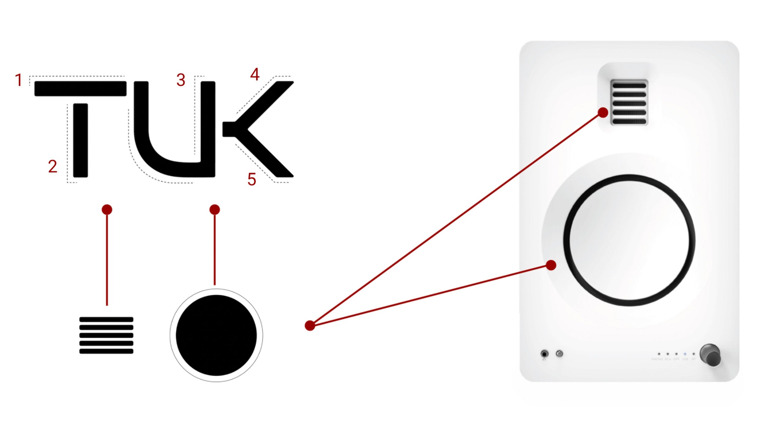
After some discussion with my creative lead, and feedback from my marketing manager, this was the final logo that we thought suited the product the best.
Inspired by the slightly rounded corners of the speaker casing and the sleek AMT design, this logo is a legitimate representation of TUKs silhouette. I took the 5 lines from the AMT to create the letters, and the curve of the driver to embody the ‘U’.
This was a packaging mockup concept my creative lead and I created.